Friday, May 30, 2014

George R. R. Martin Portrait Process

When I started this piece, I knew I wanted the image to have a design fitting for a Tshirt, so it had to have an interesting silhouette. I didn't want it to look like it was just a rectangle pasted onto a shirt, I wanted it to look like it belonged.
1. Initial Sketch
1. With my sketch I established the overall shape of the portrait, as well as a base color to serve as a suggested shirt color. I was trying to make sure I had all of the features where they needed to be so that things wouldn't look wonky once I started painting.
2.
 2. Here I start to give the face some form, I'm working in broad strokes, trying not to think about detail for now, I want the bigger shapes to work on their own first.
3.
3. Punching up the values with an overlay layer. By saturating the blues I'm trying to give it more of an icy cold feel to it. I knew from the start I wanted to give him bright, glowing, blue eyes like the wights / white walkers are described as having, and I was following the visual cues from the show. Also started blocking in the beard, again broader strokes first, detail comes later.
4.
 4. Hey, it's starting to look like George! Here I added in the rims of the glasses, brightened up the eyes and started laying in the fine beard hair details. Now that it looks like the right person, time to rough him up a bit...
5.
 5. Snow. He had to be covered in snow. This was pretty much a requirement if I'm going to make him an Other. I thought icicles hanging down from his visor would be a cool touch too. I tried to make sure it didn't look like the ice was melting, because after all he isn't emitting any heat, he's a source of cold. I also start working on the fur-line.
6.
 I wasn't entirely happy with the fur the way it was, so I thought back to the show, and looked up some photos of good-ole Ned Stark, and took a close look at how his cloak worked. I saw the fut didn't actually completely encompass his neck, but instead, it came to intersecting leather straps in the shape of an X that keeps the cloak on the shoulders of the wearer. Much happier with the change. In order to get the leathery texture, I downloaded some photos of leather from CGtextures and placed them over the straps to make them look real, and from there I added hand painting to keep it from looking too photo-like. I was having trouble painting both sides of the fur cohesively, so I copy pasted and flipped the one side onto the other, you can see their identical above.
7.
7. Even more snow. Seriously, every inch needs to be covered, these guys are from a place called "The Land of Always Winter". I also covered up the fact that I mirrored the fur by adding the snow on top, I'm pretty happy with how that worked out. From here I just kept adding more and more detail, including the little gem that I saw usually accompanying the hat George is always wearing, I thought it gave another interesting element to the piece.
8.
8. At this point, I decided to do some end of the painting level adjustments to really make the piece pop more, especially with the eyes. Also, since I didn't bother masking out the piece in the beginning, I had to do it at the end, the red area shows the part that is masked out. Everything that isn't red is part of the actual printed image if it were to appear on a shirt.
9. Final Painting
9. After some consideration, while I still think the painting would look awesome printed on a Navy Blue shirt, I decided that for showing off the image online, it looks much better on a black background. It just makes everything pop out more in my opinion.

I hope you enjoyed seeing my process of how I turned George R. R. Martin into a White Walker. I know it doesn't happen that way in the books but I hope that other readers can enjoy the homage.

And a sincerely warm thank you to George R. R. Martin for creating my favorite world to get lost in  and explore. I can't even begin to add up all the hours I've spent enjoying this story.

Buy a print of the above piece on my InPrnt shop! CLICK HERE

Wednesday, May 28, 2014

"The King of Winter", A Tribute to George R. R. Martin

 
George R.R. Martin "The King of Winter"


Game of Thrones is such a huge thing these days. It's everywhere, and everyone is talking about it with great excitement. Like many others, I got my first taste of the world of Westeroes (and far beyond) thanks to HBO's show based on the "Song of Ice and Fire" novels by George R. R. Martin. I watched the first 2 seasons and soon became completely consumed. After hearing how great the source material was and me being unhappy with having to wait a year for the next season, I eagerly sought out the novels and read them all, back to back to back to back to back. By the time I was done I was completely engrossed, and ever since it's been my new favorite piece of media. There's just so much to enjoy from these books, so much so that you are pretty much guaranteed to miss many of the extra golden nuggets of enjoyment first time through. I've enjoyed these books and the show so much that I'm always itching to come up with a fun idea for a painting based on the series. But because of the show's popularity, there's already tons of other fan-art out there already, so it can be tricky trying to come up with what I could paint that might stand out. Do I paint a creature? Do I paint my favorite character? My favorite scene? I thought about it and decided to paint George himself, immersed in his own world, as one of the Others. After all, he is the one true creator of all that belongs to the World of Ice and Fire, without him, we wouldn't have any of it.


I've been sitting on this idea for a while now, but I decided to finally give it a go thanks to a Tshirt design contest currently going on with Cracked.com on the topic 'Portrait of an Icon'. I'll have a post up on the step-by-step in creating this painting up in the next few days so keep an eye out if you want to see how this piece was made. Thanks for stopping by!
Buy a print of the above piece on my InPrnt shop! CLICK HERE

Wednesday, May 14, 2014

John Dies at the End, Part 1: Meat Monster with Process shots

“Prepare to meat your doom!”

Meat. Dozens of the wrapped and now partially-unwrapped hunks from the freezer, laying neatly on the floor next to the bed in an almost ceremonial fashion, the objects arranged in the rough shape of a man.

I moved the light toward the head area, where I found a frozen turkey still in the Butterball wrapper. Under it, wedged between turkey and torso, was the disembodied deer tongue, flapping around on its own accord.

Hmmmm. That was different.

Excerpt from John Dies at the End, by David Wong.

Initial greyscale sketch
John Dies at the End is a novel later made into a movie written by David Wong, the pen-name of Jason Pargin (shhh, don't tell anyone!) who is the executive editor of humor website Cracked.com. At it's core, JDatE is a chilling horror story coated with the perfect amount of hilarity resulting in a very deliciously entertaining meal.

Final color sketch
My first experience with JDatE was watching it on Netflix (it's still available for streaming) and I really loved what I saw. Being a big fan of Cracked.com, when I learned that the guy who wrote the book it was based on was an editor for the site, I became very interested in reading the book, so I hunted it down and devoured it with much pleasure. If you like horror and you like witty and immature humor you might really like this book/movie.


The book and movie are both very different from each other, yet both great, each showcasing the different strengths of each medium. One of my favorite parts of the movie was the scene depicting the monster made of  meat, the costume that they made was really beautiful and had an appropriate edge of silliness to it which was perfect for the film. However, the way the book describes that scene is a bit different, and the description of the monster is different as well. Feeling the urge to paint something JDatE related, I decided to tackle the book description of this scene.


If you want to know exactly what it says, pick up the book (you'll only regret not reading it, trust me). But for my painting I wanted it to be as close to the text as possible. I spent a lot of time skimming over the text to make sure I had all the details, from the bedroom setting to the Butterball-turkey head. It was a very tough challenge for me. I wanted the unsettling mood to be just right, the pose needed to convey what I wanted it to and despite the monster's lack of eyes, I wanted it to stare into the viewer, as if it was ready to step forward.


I really pushed this piece further than any other piece I've done so far. I called it "finished" about 4 or 5 times before finally posting it online. It got pretty tiresome at times, but in the end, I think it really paid off, and I'm very happy with how the piece turned out. Thanks to Stephen Najarian, and Alex Gustafson, for giving me advice on the piece, and extra special awesome thank-yous to JDatE connoisseurs Liz Goss and Heather Hudson, for their very helpful suggestions to help me nail the piece as close to the book as possible.


Heather in particular offered me some really great insight to the piece and pointed out something really important about the piece as a whole. In the end, the piece as it was was doomed to fail as a fully fleshed out illustration for a general audience. It lacks the storytelling elements necessary to convey a clear story to the viewer and winds up just being a meat monster in a bedroom without any context. I spent so much time trying to nail the details and rendering everything as best I could, but because I didn't plan it out better, there will always be something missing.


It was very frustrating to hear this advice, not because I felt put down, but because I knew I could have an even better piece if I hadn't missed the opportunity. It's the kind of comment that's going to rattle around in my brain come time to tackle the next piece, and it'll be all the better for it. So a sincere thank you to Heather for that push.


Still, that's not to downplay my excitement for the piece. Despite the fact that most people won't know what they're looking at, I think any JDatE fan would be able to instantly recognize this scene, as I feel like I've succeeded in depicting the description in the text. In the end I'm still left with a piece I'm very proud of.

Final
I hope you've enjoyed seeing the new piece as well as seeing the process shots throughout this post. This won't be the last JDatE piece I make, but I don't want to give too much away. I will say that it's monster related, and that's all. Lastly, speaking of Cracked.com, I'm hoping to announce some news regarding a project I worked on for them soon which I'm very excited about sharing. If you're interested in purchasing a print of the Meat Monster piece, click this link to my InPrnt shop. Alright, that's all you're getting out of me from now, go read and watch John Dies at the End!

http://www.inprnt.com/gallery/mike_burns/meat-monster-john-dies-at-the-end/
Click the above image to go to my InPrnt shop!

Monday, April 21, 2014

My First Job for Wizards of the Coast - Dungeons & Dragons 5th Edition: Xorn

Xorn - Linked from the Escapist

About a week ago at PAX East, there was a Dungeons & Dragons panel where they spoiled some of the artwork for the upcoming 5th Edition. And since a painting of mine was shown before the audience in attendance for the panel, I think now is as good a time as ever to announce that I did my first work for D&D that will be published in the 5th edition Monster Manual!


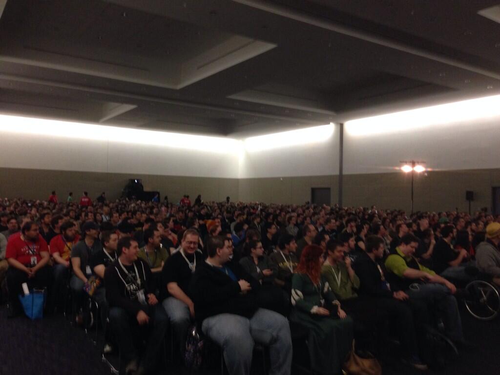
Thanks to Mike Mearls for posting this photo from the D&D panel at PAX East on his Twitter!

The creature I painted is a classic D&D monster called 'Xorn', and since my artwork was included as part of the D&D panel it was put onscreen before a room-full of D&D fans, which is a pretty awesome feeling. D&D is a game I really admire and miss playing, I'm very happy that I finally got the chance to be a part of it's creation, especially in time for this brand new edition to come out.
Shot of the audience for the D&D panel at PAX East 2014. From Mike Mearls Twitter

This was my first job for Wizards of the Coast and I consider it a huge step-forward for my career. I'll be making another post soon to share some of my journey towards landing my first job on D&D for anyone who's interested.
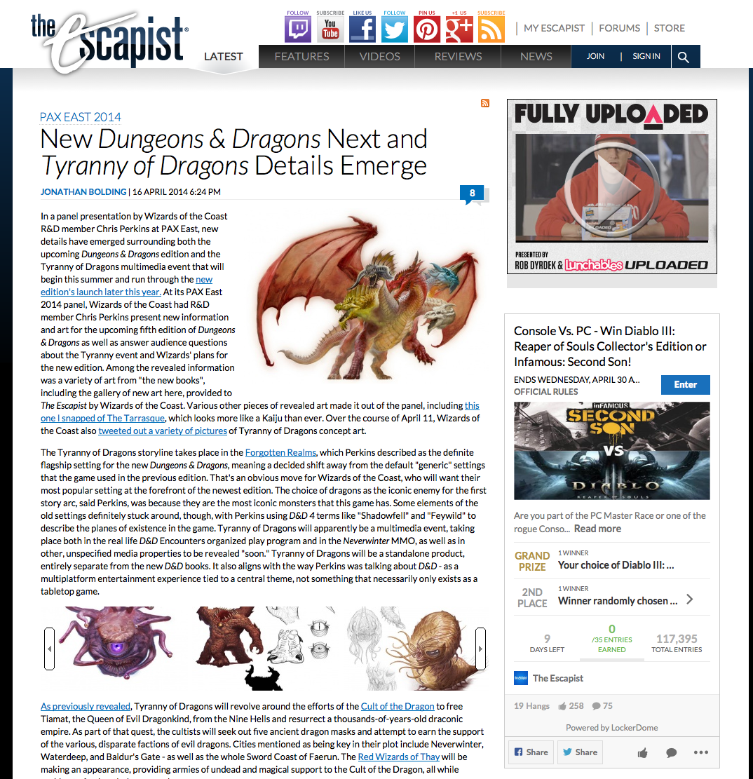
Article on the Escapist on D&D 5th edition and showing some of the art, one of which is my Xorn!

Lastly, I just want to extend a big thank you to everyone who's taken the time to look at and critique my work, and give me feedback and encouragement. Extra special thanks to Jon Schindehette for giving me my chance to work on Dungeons & Dragons and to D&D veteran artist Chris Burdett who really helped guide me through my first job with Wizards and helped me keep my head on straight! This has been a huge goal of mine for a while now, but it's not time to slow down, gotta keep on moving ahead.

(I've only posted the versions of my artwork that I found online, I'll be sure to update this post with higher quality images once I get word that I'm allowed to).

Friday, April 11, 2014

The Origin Story of the Head of Uulhj: “Jowls of the Mad”

Head of Uulhj: “Jowls of the Mad”

 An Origins Story by Kevin Holmes

Head of Uulhj: "Jowls of the Mad" painting by Mike Burns

Far removed from the world’s surface rests a network of caverns lined by the drool of the Uuhlj. In time since lost, a demonologist cult sought to unleash chaos onto the world by opening a gateway to a dimension of pandemonium, only to become quickly overcome by the madness they had sought to embrace. With much difficulty and after much death and destruction, a band of demon hunters with a foundation of experience backed by powerful curse wards and sanity charms was able to hunt down the Uuhlj. Though the demons were immortal, the hunters sealed them away in one of the darkest corners of the underground, binding them completely and leaving them with no possible means of escape.


Innumerous years passed as the stories of the demons, their cult, and even those who fought against them were lost to time, yet the demons remained, furiously gnashing against their indestructible shackles. As their bonds did not break, their bones began to twist, their flesh tearing over eons as their heads severed themselves from their torso. With their bodies bound, these demon heads drifted off through their vault to aimlessly roam the long since abandoned connecting tunnels.


Uuhlj are fearsome in a way very different from an adventurer’s traditional encounter in that they are remnants of an immortal terror and cannot simply be defeated. Though incredibly slow in nature, their sheer presence emits a terrible aura of madness, causing the afflicted to suffer from a range of detriments ranging from paralyzing confusion to sinister and murderous suggestion. Often those unfortunate enough to encounter the head of the Uuhlj are more likely to find themselves backstabbed by befuddled allies than they are to get reach the fiend’s proximity. Should the demon ever wrap the shambles of its jaws around an unsuspecting victim, that person’s mind would surely be lost to madness forever.


Careful preparation is the cornerstone of living through an encounter with the head of an Uuhlj. With the aid of powerful curse wards or sanity charms, adventurers are able to approach the demon heads from a careful distance. At a range, the Uuhlj’s already tattered skin can be torn further with much resistance, and though it is impossible to kill one entirely, mangling one beyond recognition would certainly immobilize it, though the demon shreds may still prove problematic to those who encounter them in the future.

-----

Kevin was an old roommate and good friend of mine from college, and he has a good head on his shoulders when it comes to designing monsters and their back-stories. I didn't have anything super specific in mind when I painted this piece, but Kevin saw it and then wrote up his own idea for the origin of this monster, which I was very excited to include here in my blog. It was a fun experiment and I hope I we get the chance to do this again in the future. In the mean time, if you liked Kevin's story, you should follow him on his twitter page. He's in the process of building up his web presence right now, but if you're interested in seeing some of Kevin's future projects that would be the perfect place to be to find out about them. Thanks Kevin!

Wednesday, April 9, 2014

The birth of the "Head of Uuhlj"

I was at the laundromat recently without anything to do while waiting for my laundry to do it's thing when suddenly I pulled out my sketchbook and started doodling. As usual, I started out sketching a bunch of not so great drawings that looked really bad, but after enough tries I eventually came up with a sketch I liked and would later wind up painting...
"Head of Uuhlj"
Jim Pavelec's new demon book "The Golden Ones" was finally distributed, and since I donated enough to his Kickstarter for it I got a copy. It's a really amazing book full of some very impacting, and creepy artwork. It made me really want to sit down and take another stab at designing my own demon, and that's what I had in mind when I did the following sketch...
1. Initial Drawing
1. A tight drawing leads to a tight painting, so it's good to really put the effort into nailing the drawing. Looking back, there are a few things I could have described better at this stage, but overall I was happy with what I came up with.
2. Flat colors, hints of form
2. Here, I laid in some flat colors to help me separate the creature from the background. I knew I wanted this painting to have strong shadows, with a feel of emerging from the darkness, so I filled a layer with a dark purple to unify the colors and to give me a good base from which to build up my lighting.
3.
3. At this point, I'm starting to figure out all of my forms and I'm trying to introduce some color variety so it has more life to it. Trying not to get too detailed.
4.
4. Here, I introduce a spotlighting effect. This is where I decided that I would leave the lower half in shadow and illuminate the top half. I'm really thinking about the mood I want to get from this piece. I also hint at the lighting off camera with the red in the lower left and the glow in the upper right.
5.
5. Pushing the lighting, trying to describe the tumorous forms on his face, borrowing a trick I saw in Donato's Mechanic tutorial video. I also decided this needed to exist in an environment, so I came up with the idea to add a staircase to help lead the eye up and around the piece, and I echoed the staircase in the background to give the piece some depth.
6.
6. Since my environment is mostly blue/purple and along with the help from Stephen Najarian who gave me a paint-over critique, I came to the conclusion that red just wasn't working for a back-light, it just didn't make sense in the environment, so I in some bluish bounced lighting into the shadows, to make it feel more like it was a part of the setting, plus it gives a good hot/cold dynamic between my highlights and shadows, also added some colorful glow to the steps. I originally called this piece DONE when I reached this point...

7. Final
7. ...but then I got another really helpful paint-over critique from Sam Flegal, who encouraged me to punch up the colors and contrast in my values. I also got a lot of feedback saying that he should be more wet and slobbery. So I took another couple passes at the piece and I'm really glad I did because I think this new version has a lot more impact than before.

I mentioned on my Facebook that I had something special in store for this guy, but I'm leaving that for the next blog post, so come back Friday and check it out. Thanks for stopping by!

Monday, March 24, 2014

Meet Syrup, the D&D Vampiric Pixie

A friend of mine recently commissioned me to paint the character he's playing as in his D&D campaign. The description sounded pretty fun so I was eager to take a stab at it, he described her as a Pixie turned into a vampire who hates the sun, loves sweets and has a vendetta against birds.

Syrup
Here are some of the sketches I did to test out some options...

I'm really fond of the shape of the hair in pose C, and I'm hoping I can have a chance to use it somewhere in the future, but in the end you have to go with what the client prefers, and he told me how important it was for her to have a hood on. Which makes sense, considering she's a vampire.

It was a fun job for sure. It's nice to have a specific personality and details to work with as opposed to just another generic fantasy character.