Monday, August 6, 2012

College Humor Playing Cards

This is College Humor's logo
The project I worked on with College Humor has finally been released and so I finally get to talk about it! I was approached about doing some artwork for a College Humor themed deck of cards. The original idea was a little bit different than the final product, but I think we came to a successful conclusion.
Card back (designed by College Humor)
Over Skype, I discussed the original ideas with a group CH of writers. They came to me with the idea of giving the deck an internet theme since CH's main platform is the internet. I gave my own feedback on the ideas provided by the CH team but they had a pretty clear idea of what they wanted to do so it was mostly just tweaking and refining their original ideas.

Check out my new threads. Get it? Because they're SUITS??
Each suit would have it's own newly designed pips for each suit: Spades, mouse pointer; Hearts, power icon; Diamonds, wifi icon; Clubs, USB icon.

The royalty
Then each suit was assigned it's own theme for each of the face cards. Spades featuring various PC icons: the King with his mouse pointer swords; the Queen with her hourglass that everyone dislikes so much, including her; and the jack with his pointer finger for clicking links. Hearts featuring different computer accessories for faces: monitor King, keyboard Queen, and mouse Jack. Diamonds pay homage to various internet memes...can you guess them all?? And finally, Clubs referenced various adorable animal videos that saturate the interwebz, including a King of Corgi, a Queen of Cat, and a Jack of Sloth.


Jake and Amir
Jake & Amir and their show
Jake and Amir and their cards
Last up are the Jokers, which feature two of CH's most popular stars, Jake and Amir, from the sketch show titled Jake & Amir. The Fedora on Jake is an inside joke for all the Jake and Amir fans.

This was a really exciting project to get to work on and you can probably tell based on my portfolios that this is pretty different than the work I usually do. It was a real pleasure getting to work with the College Humor team and I really hope I get the chance to do more work with them in the future; such a blast and it felt extremely rewarding.

So by now I'm pretty sure you want your own deck, right? Of course you do! You can purchase your own deck of College Humor playing cards on the website Busted Tees by clicking HERE

Sanbone Trio: Part 2

A while back I posted a portrait of a character from the video game, Gitaroo Man. His name was Carrot and he is the leader of the Sanbone Trio, a musical group made of of 3 skeletons that use their own boney bodies for instruments. I recently finished another portrait of another member of the group named Pine. Below you can see the new portrait right beside the old one. Will the Sanbone Trio ever be complete? You'll just have to keep an eye out and see for yourself ;)
Pine & Carrot

Saturday, July 28, 2012

The Return of Glompus

I recently received a note on DeviantArt in regards to a critter I sketched a few years ago. I was told that apparently the drawing below has become quite a hit on the gamer community website twitch.tv.
The Lost Glompus
The individual who contacted me requested that I repost the image if I still had it, because it had somehow been lost on their site and it no longer on my DA page. This dopey faced critter had been lovingly named Glompus by the twitch.tv community. I happily reposted the picture and it quickly got around and some fans even left some very nice comments which I really appreciated. After some searching I even found this youtube video that shows some of the excitement of the Glompus fans (see comments on youtube).
Finding out about all of this has been a huge and pleasant surprise. It's really awesome to know that there are people out there who appreciate one of my pieces so much. In hopes of thanking everyone who has shown their appreciation of my work, I went ahead and repainted Glompus.
The Return of Glompus
I hope everyone enjoys this version as much as the last! In case anyone is interested in having Glompus on their wall, I went ahead and posted the piece to my Society 6 page and made it available for ordering prints of him in all of his slobbery glory. Thanks again to the community over at Twitch.tv!

Monday, July 16, 2012

General Mills Cereal Monsters Series

I recently finished up my Boo Berry illustration which concludes my General Mills Cereal Monsters series. You can go back and look at the individual posts for Count Chocula, Frankenberry, and Boo Berry. Some of you may realize that I'm leaving out Fruit Brute and Yummy Mummy, but I decided to leave those guys out because I didn't grow up with them and I'm not familiar with the characters or the cereals. Here are the illustrations again all in one place for convenience.


I had a blast coming up with these redesigns and painting the final illustrations. This is definitely some of my best work right here and I'm really proud of how everything turned out.  I hope you've enjoyed watching my progress on these pieces. It's a lot of fun to put my own spin on familiar characters and I plan on doing more similar work in the future. As an added bonus, for fun I worked up some mock Magic the Gathering cards featuring my monster paintings. Enjoy, and thanks for stopping by.

Friday, July 13, 2012

Boo Berry

I'm happy to present to you the final piece in my General Mills cereal mascot series. This time one of my favorites, Boo Berry.
 I'd like to share an what the process of creating this piece was like from start to finish. First step, is to come up with a redesign for the Boo Berry character.
Boo Berry was the most challenging of the 3 characters to redesign. There isn't much to him except for the hat and the bow-tie, so I wanted to make sure I made my redesign somewhat recognizable. Maybe not to the point where everyone sees it right away, but as long as you can make a guess and believe that it could be him.
I like to just scribble random ideas down in my tiny moleskine sketchbook. A lot of the time these wind up looking really ugly and not too special, but it helps me not care so much about the quality of the drawing thus helping me focus on the design. I really live the bottom right sketch (above image), but I thought it looked too far off from Boo Berry. I hope I get to use that design for a later project, but we'll see.
Next, I try doing some digital sketching. Sometimes using a different medium helps change the way I approach drawing and I'll come up with different ideas . I wound up sticking pretty close the the bottom sketch (above image).
Now that I'm happy with a design, I decide to start building up a composition and a story. During the design stage I try to keep in mind that there should be an overall story to go along with the final image. I sketch some rough ideas for what I want going on and different ways to show the many scenarios. I wound up falling in love with the last sketch (bottom right, above image).
I roughly drew out everything once I settled on a sketch. From there I lowered the transparency and executed the final drawing on a separate layer above the sketch. This way I don't have to worry about hiding the sketchy marks in the painting stage.
Next, I do a some really rough coloring under the final drawing. This way I can figure out how I want to organize values and colors. When I moved onto the final painting I did a lot of color picking from the above image.
Above you can see that I've rendered out the entire image...except for one important part...can you tell what it is? Yes, I didn't sign it yet but I also left out Boo Berry. The reason for this was that at the start of this piece I knew I wanted to have Boo Berry transparent to make him look more ghostly and also it looks cool too.
 I place the drawing of Boo Berry on top of the background and render away at the character. Once he's done, I used a layer mask to add transparency to certain areas.

And that was it! This was a really fun piece to work on and I feel like I really pushed my self in certain areas like the foreshortening of his hand reaching out for the basket of blueberries as well as the transparency of the character and every the rendering of the foliage up front. All of these are things I haven't really done much of before I they're all packed into this one piece. I hope you enjoy looking at this piece. I really enjoyed painting it.

Wednesday, June 27, 2012

New work for Pinnacle Games Published

Here are a couple portrait illustrations I did a few months ago for Pinnacle Games. They were for their Hell on Earth setting. I did a few portraits for a couple other settings as well and I hope I get to post those soon too.


Saturday, June 16, 2012

The Birth of Frankenberry


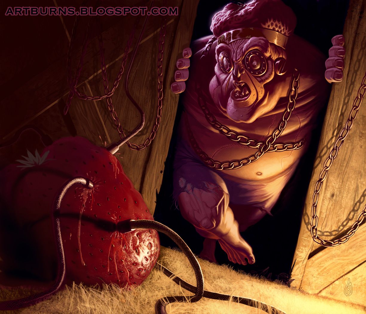
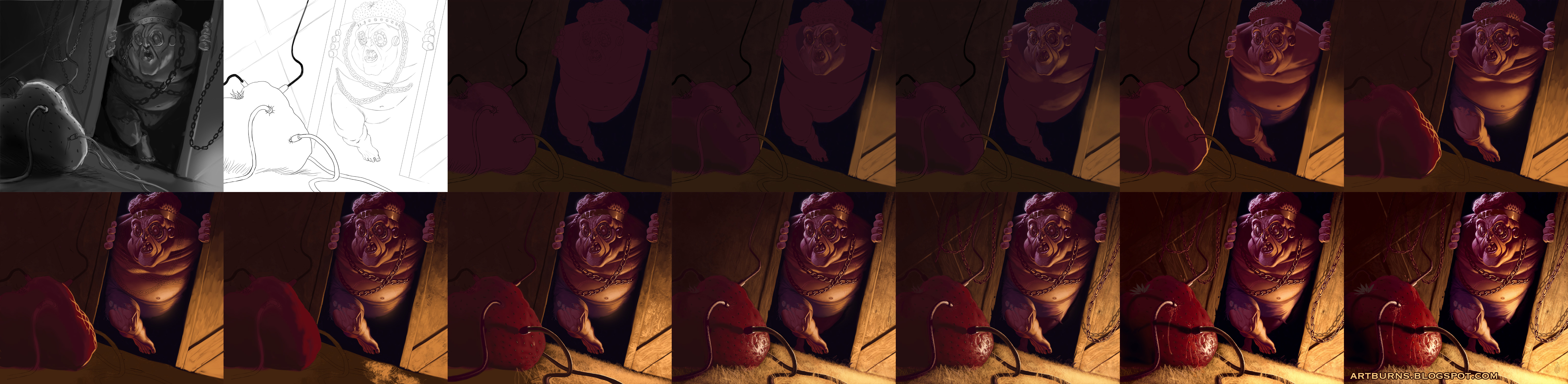
Or should I say rebirth?....adoption? Anyways, this is the 2nd piece in my ceries on cereal characters in General Mills' Count Chocula universe...CERIOUSLY! This time showcasing the character Frankenberry, the Frankenstein-like mascot of the sugary strawberry cereal, Frankenberry. This time I thought I'd share some of my process in creating him.
I spent a lot of time sketching to figure out how I wanted to reinterpret this character. Above you can see a few of the reference images I used. I wanted to make sure I kept my Frankenberry recognizable (keeping in the metal eye-pieces, chains, head-shape) while at the same time trying to be unique. I wanted to make him my own. Below you can see some of the early sketches I did while trying to design the character. Not all of the sketches wind up being winners, but that's the whole point. I wanted to push past the early ideas (most of them weren't so great). I wanted to try and create something really interesting. When I did the sketch on the bottom-right (with Frankenberry written next to it) that's when I knew i was onto something and from there I started sketching digitally.
I wanted to hint at story and create an exciting composition. I used the digital sketch below as my value study and I referenced this image throughout the execution of the final piece. You can see that things aren't exactly the same but it definitely helped inform my decision making when painting the final.
I always thought Frankenberry had an oddly shaped head, so I decided to do something fun with it. I made the top of his head a shriveling strawberry, that's what fuels him. Hence the urgency for him get to this other giant, lush strawberry oozing with juicy goodness in the foreground. It's time for a tune-up for Frankenberry. Time to change out strawberries.
 I hope you enjoy this piece. I spent a lot of time creating it and it's one of my favorite portfolio pieces at the moment. You can probably guess who's coming up next. I plan on him being my new favorite so I hope you'll keep your eyes peeled for him. See you next time!