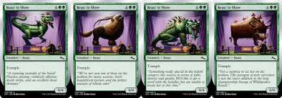
The concept behind this image is to poke fun at Magic having a history of using the "Beast" creature type as a catchall for a huge range of made-up creatures. "Beast" is pretty much akin to the "Isle of Misfit Creature Types" -- if it doesn't fit another creature type, it gets the "Beast" stamp and is sent along its merry way.
I was asked to present the beast as if it was taking part in a dog-show, with the displayed creature winning the prize of "#1 Beast". I had fun with the pageantry of a dog-show, and adorned this creature with some bows, a jeweled collar, and pink nail polish. Aside from being a cute color, pink also does a decent job covering up any blood left over from the beast’s last hunt.
After the image was completed and approved, I was ecstatic! "What will they hire me to do next?", I wondered curiously...
You may have noticed a similarity or two between this and the last image. That's because I was asked to do a second version of the same illustration, for the same card.
My first reprint! How fun!
For this one I was asked to reference a different type of creature that had also been previously represented under the "Beast" creature type. For this one, I wanted to take advantage of the poofy Gnarlid fur and have the creature done-up like a poodle. And, if a poodle had horns, it would probably use them for scratching hard to reach places.
Now let's mix things up a little bit...time to show you my third ever card illustration...
You may have noticed the same similarity between this and the last image and the image before that. That's because it has the same similarities, but what you might not have noticed is that its differences are different.
For this one I was asked to reference an even differenter type of creature that had also also been previously represented under the "Beast" creature type. Baloths have been depicted with some pretty wild facial expressions, so I wanted to capture that in my rendition. I kept this one pretty straight-forward so as not to distract from the creature's crazed face.
Now, before I present my fourth ever Magic card illustration, I see that look in your eye and I'm happy to say that the answer is yes...
...there is also a fourth version to this card.
You may have noticed the same similarities between the last three images and this one except there is one similarity that is different yet it's the same difference as the others, and so for this image I threw in yet another difference, to keep the images from looking too similar.
For this one I was asked to reference an even differenterer type of creature. I really wanted to capitalize on this creature being covered in hair. The bows in the first depiction were a fun element, so I decided, "let's go all out on the decoration with this one". It would also be pretty adorable if it had pigtails, and bangs covering its eyes. Lastly, the part that makes this version differenterer from all the others is that, the creature is removing the hat from the judge's head. It was fun to add in a slight change to an element outside of the creature that differentiated this card from the others.
Ready to see version 5? It’s the most differenterest of them all!...
...
...
...
 |
| ...just kidding. There are only 4. |
That'll do it for my first-ish Magic card commission. It was an honor to paint a cycle...or would I call it a reprint?...an also-print? Whatever the case, these pieces were loads of fun to make and I hope you all enjoy them.
For some added trivia, I first painted all of the foreground and background elements that would appear in all versions, and I had a separate layer in-between the foreground and background where I would be able to easily switch in and out the different creatures. This way it was easy for me to keep the image consistent and added to the fun of the image.
I have to say, hat's off to whoever wrote the flavor-text for these cards. It really delighted me to see the flavor text tying in some of the details I added to each piece. I literally laughed aloud when I read the baloth flavor text.
 |
| Alternate Sketches |
< < < Previous Entry: Intro


No comments:
Post a Comment