Friday, September 30, 2011

Inspiration Spotlight #4 - Magic: The Gathering

I've been playing Magic: the Gathering for about 4 years now and I'm a pretty big fan of the a lot of different aspects of the game. For one, it's a really fun game! There are seemingly endless card combinations for making your own personal deck allowing you to cater the game experience to your own style of play and allows you to cook up your own strategies for playing. As much as I enjoy the game itself I'd probably still be collecting cards even if I decided to quit playing, and that's all because of the art.
What made me love the art even more was when I picked up on the fact that the whole Magic universe has its own story that goes along with each set, giving each new set a unique flavor to it. To give you an example of what I mean by flavor, look at the card Daggerback Basilisk, below. Cool name, appropriately cool picture, cool ability, and some awesome flavor-text puts the cherry on top. Every part of the card is tied together making the overall appeal of the card much more interesting than if the creators had not gone through the trouble of doing so. In the end, this aspect of the game makes Magic a lot more fun.
The art hasn't always been as pretty as it is today. Magic has come a long way in all aspects of the game and the art is no different. The standards for Magic artwork today is absolutely jaw dropping, and I feel like I've still got a long ways before my work is up to that caliber. It's one of my goals to get commissioned to work for Magic, ideally before they decide to come out with a new joke set like Unhinged / Unglued (look them up if you haven't seen any of the cards, they're freaking hilarious). Until then I'll keep on pushing and keep on playing.
 
What led me to write a post on Magic was the fact that their new set, Innistrad, is being released today and I pre-ordered a huge box of booster packs that should be on their way at the time of this posting. I'm splitting the box with a friend and it should be a fun day of opening cards and building decks when they finally get here. This set looks absolutely amazing in regards to art, game-play and flavor. So much fun to be had very soon! If you wanna check out what the set looks like, all the cards have been posted on the Magic website here.


Wednesday, September 28, 2011

Power Rangers Piece: Sneak Peek

I was out of town for a few days and I didn't get any work done during that time so here's a little preview of what I'm working on now. It's a monster from Mighty Morphin Power Rangers. Can you guess which one??

Monday, September 26, 2011

From the Moleskine #3

I went to a party recently and brought the ole Mole with me. Here's some of the stuff I did. As you can see, not everything is a gem. Honestly, most of the stuff I sketch is pretty awful, but once I do draw something I like it makes it that much better.

Friday, September 23, 2011

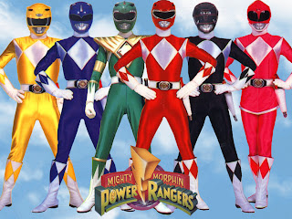
Inspiration Spotlight #3 - Mighty Morphin Power Rangers

Power Rangers...that's right, Power Rangers. But not just any Power Rangers, I don't really care for the sub-space, Eskimo-pirate versions that came later. It's all about the Mighty Morphin for me.
Like many people my age, one of the shows I grew up watching was Mighty Morphin Power Rangers and it was one of my favorites. Sure the quality wasn't all that great compared to what we have now, but at the time that show was the epitome of awesome. I remember drawing the Power Rangers a LOT when I was younger and I especially liked the green ranger's design. I think the fact that his costume was so different from the others really interested me, something about that gold triangle thing he wore was really cool to me. I'd like to take a moment to comment on how annoying it was that it was almost impossible to find the green ranger action figure too...moment completed

The zords were really awesome too, and you knew when they came out the Power Rangers meant business! From a concept art perspective, it's interesting how the dinosaur theme carries between their costumes and their zords, as well as how they all work together.
Lastly, and once again, I gotta mention the monsters! Say what you will about how awful some of them looked on TV, but I still think there are some gems in the monster designs that appeared in the show. I'm playing around with the idea of doing some redesigns of a couple of the monsters as a personal project, but we'll see what happens.

Wednesday, September 21, 2011

Some recent highlights...

I've been pretty busy with freelance work lately and I haven't gotten a chance to do any doodling for myself lately, so I don't have anything to display at the moment.

I did however finish up 3 black and white pieces for Savage Mojo, and 3 black & white pieces for Headless Hydra Games. They were commissioned to be done in black and white, but I'm considering adding color to them for myself for when I add them to my portfolio. When they get published I'll share the pieces and I plan on talking about my process a bit for each piece to give an idea of how I come up with ideas for my commissioned work. Until then you're just going to have to sit tight.

I also got contacted by a greeting card company and I'm in the process of working on my first couple of cards for their humor line. I'm pretty excited to get a chance to work in 2 completely different fields of illustration. I'm already realizing just how different doing fantasy-gaming work is from doing greeting card work, and I'm just getting started doing the card work! I'm enjoying the different approaches and thought processes involved with working in each genre and I can't wait to start showing what I've been doing.

I also wanted to note, I'm a member of the Sketchoholic community and my "Gentle Treefolk" piece is getting a full page in their zine titled 'Cutesies'. Inside you'll find TONS of adorable artwork along with some awesome interviews by awesome artists. If it sounds interesting, why not pick one up and support the community! You can preview the book and order yours HERE!
(Cover image by "Victorior")

Monday, September 19, 2011

Art Order: Anonymous Challenge

Yesterday was the deadline for entries for the new Art Order challenge: Anonymous / Trying Something Out of the Ordinary. Out of the 4 options of characters you could illustrate, I went with the red, tentacle, dragon-ish monster due to my lack of interest in the reference material, funny enough. I decided I would try and make something interesting out of an uninteresting source of reference, and I did a satisfying job I think.

Here's the original image to use as reference:

..and here's my take on it:
The line-up for this challenge has been posted, check out all the entries HERE!

Friday, September 16, 2011

Inspiration Spotlight #2 - Silent Hill / Masahiro Ito

For those of you who know me personally, this one isn't much of a surprise. I've been a huge fan-boy of the Silent Hill series ever since I played the first game when I was about 11 or 12.  

Silent Hill is a survival horror franchise that centers around a town with a dark past and a mysterious power. What makes the games great are their amazing storytelling, scary and disturbing atmosphere, and a killer soundtrack by Akira Yamaoka that chills spines...plus you know, lots of other stuff too!

I'll never forget my first time playing the first Silent Hill, it was the middle of the night, lights out, and I was visiting at my grandparents house in upstate Pennsylvania, so it was in the middle of the mountains. In other words, the playing conditions were PERFECT. I was too afraid to play the game for very long myself so my cousin took over the controls and we ran through the whole game in one night. Since then I've been hooked on the game series, fairly obsessively I must admit...I guess passionately would be a better word.
One of my favorite parts about the Silent Hill games are the monsters. First of all I love monsters regardless and I always have and always will, but there's something special about the monsters in these games. I've noticed a lot of monsters these days are really over the top, in-your-face-scary. But the monsters created for these games by Masahiro Ito are more conservative but still very striking and unique. Many of them are deformed humanoids that give you a sense of familiarity and yet the fearsome unknown. Below is a concept sketch of Ito's most famous creation from the series, Pyramid Head.
Ok, you get it, I love Silent Hill. If you haven't played the series and are now interested, I recommend starting at the first game and playing games 1 through 4 (the ones made be the original Team Silent). For those of you reading this who already knew how awesome Silent Hill is and just want to get your fan-boy SH-fix on, I recommend watching The Real Silent Hill Experience created by the guys over at Twin Perfect. It's a giant documentary on the entire SH franchise and will make you appreciate the games all over again.

(all above drawings were created by Masahiro Ito and the characters belong to Konami)

Wednesday, September 14, 2011

From the Sketchbook #2

Here's a new addition to my sketchbook. I was on a long car ride into the mountains of upstate PA and I decided to entertain myself with some drawing, but being in a moving car presented some...challenges. Since I knew it would be very difficult to keep a steady hands at all times, I decided to embrace the wobbling around aspect and decided to draw something that looked mutated so I wouldn't have to worry about getting the shapes and proportions just right. I really like what I came up with and I plan on adding to it in Photoshop, and maybe painting it up entirely.

I know it's kind of weird seeing such a creepy drawing from me right after the adorable AWWWW-fest bunny painting from the last post, but I say, what's wrong with enjoying both? This drawing also gives a bit of a hint as to what the next Inspiration Spotlight will be in a couple days. It's definitely a strong source of inspiration for this drawing, and to many of you who know me, it won't be a surprise at all

Monday, September 12, 2011

Bunny portrait in Mixed Media


A friend of mine recently worked a deal out with me where I would do a portrait of her as a bunny in exchange for her crafting me up some jewelry she made of her own. I was originally going to do this digitally, but I decided since I would be getting a physical object out of this that she should get one too. It's on 9x12 inch hot-press watercolor paper, done in ink, watercolor, colored pencil, and a little bit of marker too.

Friday, September 9, 2011

Inspiration Spotlight #1 - Kings of Power 4 Billion %

The main reason for my blog is hopefully people who come across it will see my work and think it's cool. But there are plenty of other people on the internet posting cool things too! I decided that instead of just posting my work, I'd post some links to things that inspire me; things I think are really cool.

I got this idea after a re-watched Paul Robertson's Kings of Power 4 Billion % animation, for the 4 billionth time. I wondered how many people don't know about this compared to how many people I think should know about it, so I decided I should feature it on my blog!

Kings of Power 4 Billion % is an mind blowing side-scrolling-beat-em-up video-style animation EXTRAVAGANZA and it really speaks for itself. If you have 12 free minutes and want to get the most out of them...watch the animation here...or if you want to have a copy for yourself download the animation from Paul's livejournal.

I REALLY love this animation and would watch it in a heartbeat if you asked me to, sometimes I play it in the background on loop just so I can listen to the amazing soundtrack too. Check it out, let me know if you like it...if you do, maybe I'll post some more cool things I like!

Wednesday, September 7, 2011

From the Moleskine #2

Here's another post showing spreads from my other Moleskine. To be honest I kinda prefer having the lines go across...it makes it easier when I'm writing notes down and it gives me something to measure with when I'm drawing.

I draw in the Moleskines with ballpoint pen, which often give a really scratchy, crude look, but sometimes I think that can work to an advantage if you do it right. All the blotches of ink and light line-work can give the sketch a different kind of feel. Drawing with ballpoint pen feels different because the pen glides across the page more easily, and sometimes is the reason why I prefer drawing in ballpoint pen over pencil (sometimes).

Monday, September 5, 2011

Follow me on Facebook

Some of you may know about the hit social media website called Facebook, and some of you may even be friends with me on there as well. But I wanted to share some news regarding my activities on Facebook...I've got my own page exclusively for my artwork! So if you'd like to follow my artwork via Facebook but you don't care much for my personal business, then go on over to Facebook and like my page!

Cyclops Caterpillar

You may recognize this little guy as a sketch from my sketchbook. Here he is in his fully painted glory. I really get a kick out of designing creatures, I love making up stuff you would never see in real life. I've been really pleased with where my work is headed at the moment. It's got me feeling really good and pumped for the future.

Thursday, September 1, 2011

Off to School - Collaborative piece with Anthony Briglia


Here's a piece drawn and inked by my good friend Anthony Briglia, with colors done by yours truly (aka me). I've been doing a lot of these lately haven't I? I've always loved Anthony's morbid characters and outrageous expressions and situations. I asked him if he could pass me a piece of his I could color in and he sent me this guy. I highly recommend checking out Anthony's website, he's got some really awesome work up.